
Helpvetica - Can Typography Save the World?
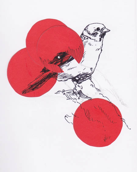
Title: “Die Neue’ by G.L
A Hope in Hel(vetica)
- To help is to contribute, promote or cause improvement in
- Make some one/ thing better
Helvetica : A Modern Story (of Moderism)
Today Helvetica is an iconic font. Back then it was 1957. Switzerland. Sleek lines and a simple geometric aesthetic informed the design of a new typeface by Max Miedinger and Eduard Hoffmann originally known only as ‘Die Neue Haas Grotesk’. Until a decision was made in 1960 to change the name. Helvetica is Latin for Swiss.
Thus was a Superfont born
“With great power there must also come great responsibility.” (Spider-Man August 1962)
A typeface with a modern attitude
Out of postwar Europe, Helvetica represented an optimistic new future.
Here, type would be neutral/ adaptable/ bold/ direct. A culture of mathematics and grid. The ‘New Type’ : a simple yet powerful industrial age vehicle for rigorous objectivity in the dissemination of information and communication. Truth, accuracy, correctness, exactitude.
Helvetica is all this
‘The meaning is in the content of the text and not in the typeface.’ (Wim Crouwel)
Politics and Hypography
Historically, typography is a barometer for changing cultural and economic paradigms. Consider Paul Renner (Futura designer) arrested by the Nazis in 1933 - Renner only released after a direct plea to Hitler from Rudolf Hess - / the revolutionary constructivism of Soviet graphic design circa 1922 / the 1996 release of Verdana bundled with Windows OS.
The influence of the font in the urban environment is all pervasive. The relentless visual repetition of typographic selections / stimuli / semiotics. Perception is the process of perceiving. See it.
Culture is Language
Language is embodied in type / hype / hypography
- Superfont in the Urban Environment
- Can Helvetica save the world?
- Do we need it to?
Helvetica has an aesthetic order that offers a clarity of form to our technologically evolving culture. Although a hallmark of modernist Swiss design, it remains ideologically relevant to our own ‘machine age’. Neutral lines enhance readability and communication. A clear message. That’s a good thing. Simplicity. Also good. Content is King. Yes.
Is the functional modernity of Helvetica a font for our times? Can our visions for a better future be best expressed with this typeface? Tell us your thoughts.
Contact Roundhouse Now!
Book an obligation free consultation to find out more and learn how to leverage mobile technology to grow your opportunities and business revenue.

Get to know Saul Edmonds & Roundhouse
As Creative Director & Roundhouse Founder Saul Edmonds has over 20 years professional design and digital experience.
He is an expert on Brand, Website and App Development. He has worked with clients across all industry groups - including startups, small business, government and entrepreneurs - on projects of all sizes and budgets.
Saul and his team can help you grow your business and discover new possibilities with :
- strategic brand design
- web design & development
- app design and development
- digital marketing
- creative engagement
Saul Edmonds believes that every project begins with a story.
Saul and his team offer a one to one, tailored service - where he works with you closely to develop innovative solutions that will take your business to the next level.
Find out how Saul can help you turn your ideas into reality.
Book an obligation free consultation with Saul Edmonds for ideas and strategies to take your business or project to the next level. Click here to arrange your booking.
Phone : +617 1300 727 749
email : us@roundhouse.cc
- Learn about our web design here.
- Learn about our app development here.
- See our brand and logo portfolio here.
Connect with Saul Edmonds on Linkedin here or Google+ here.
Connect with Roundhouse on Google+ here.